Data Visualization & Business Analytics
During my time as a Business Analyst in the government sector, I specialized in transforming complex data into clear, actionable insights. Most of my work centered on developing Power BI dashboards and reports that helped stakeholders make informed decisions — all while ensuring each visualization met accessibility, accuracy, and design standards. The examples below use mock data to demonstrate the types of analytics projects I’ve led and the visual storytelling principles I apply. Each piece highlights my approach to designing dashboards that are not only functional, but also visually engaging and easy to navigate — bridging the gap between data and design.

-
Overview
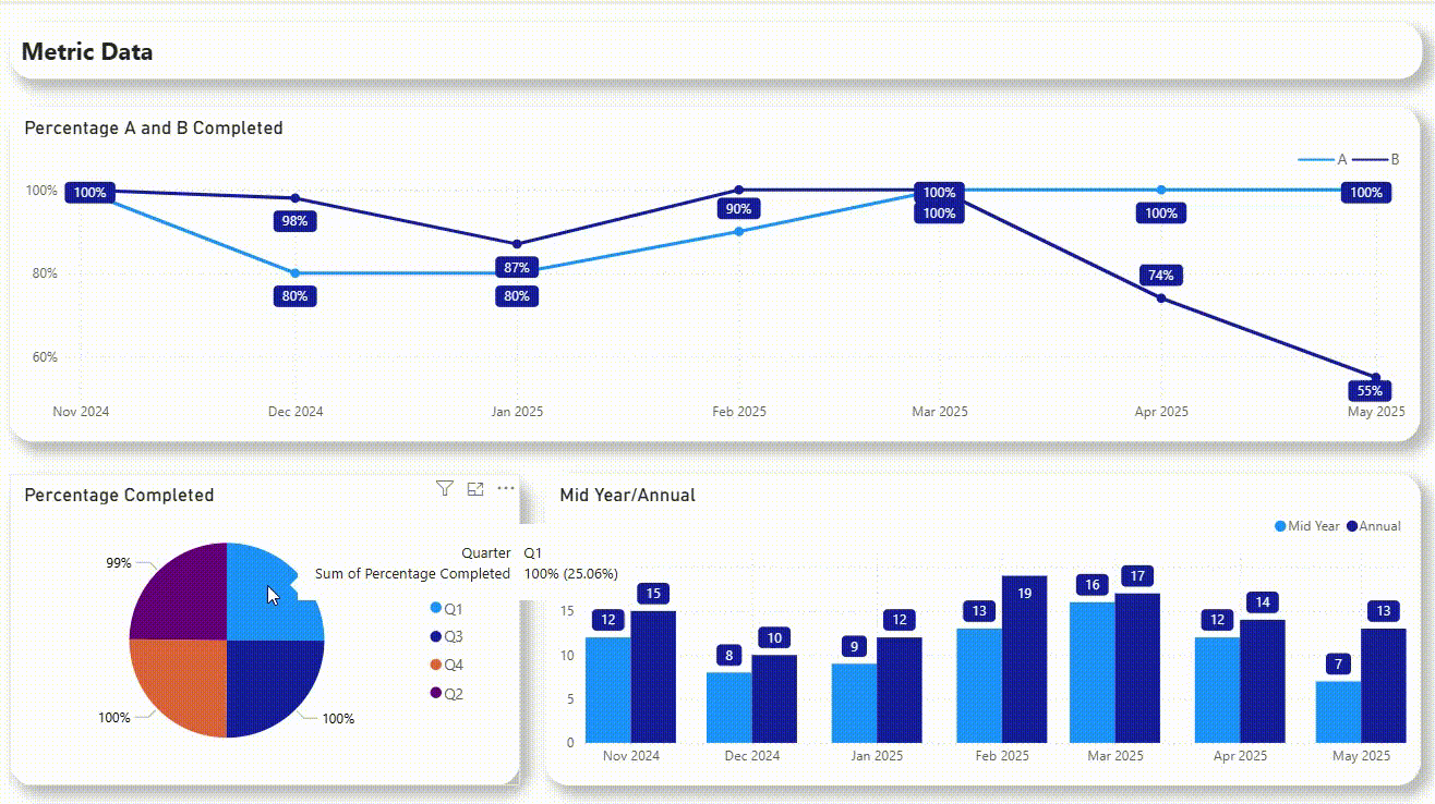
This dashboard was designed to help program managers quickly assess progress across multiple initiatives and reporting periods. The goal was to consolidate several static reports into an interactive Power BI dashboard that displayed key performance indicators, completion rates, and midyear vs. annual results in a single, accessible view.
-
Challenge and Approach
The original reporting process relied heavily on dense spreadsheets and long summaries, making it difficult for leadership to identify trends or areas needing attention. My task was to translate this data into a clear, visually intuitive layout that allowed users to instantly understand progress across multiple categories and timeframes.
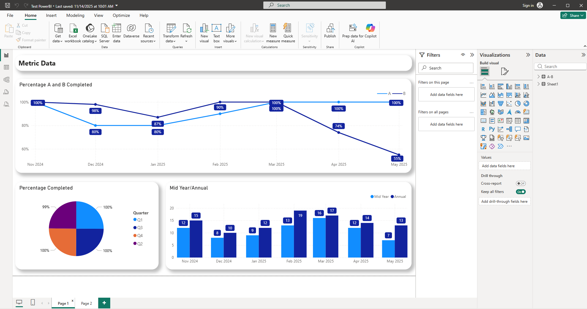
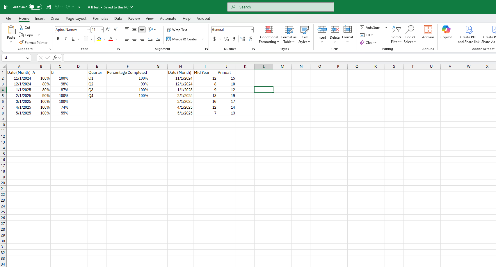
To replicate the dataset for this mockup, I built a synthetic data model in Excel mirroring the structure of the original data (with percentages, time periods, and metric groupings). I then used Power BI to connect, clean, and visualize the mock data, ensuring the visual relationships and interactions mirrored the real dashboard’s functionality.
-
Outcome
The final design provides a concise, high-level snapshot of organizational performance over time while allowing users to drill down into specific metrics for further analysis. The combination of clean typography, consistent color language, and logical grouping makes the dashboard both functional and visually cohesive — turning raw data into a quick decision-making tool.