During much of my corporate experience, I have created high-impact presentations using Microsoft PowerPoint as the primary (and often only) tool. In many client environments, tools like Illustrator, Canva, Figma, or even external font packages aren’t permitted—so everything has to be built inside the deck, within strict brand color, template, accessibility, and file-size constraints.
Even inside those limitations, I create dynamic, polished layouts that clarify complex information and feel intentional—not default.
All samples below use mock data, dummy text, and fictional names to reflect real work while protecting confidentiality.
The First ExampleBranch Management, Metrics, Operations & Overview
A leadership-ready overview deck designed entirely in Microsoft PowerPoint, built to communicate strategy, performance, and organizational structure with clarity and consistency without breaking client template rules.
The Goal:
Make complex operational content scannable and executive-friendly
Keep every element editable in PowerPoint
Maintain strict brand/template compliance while still feeling custom and high-end
The Constraints:
Various stakeholders had different ideas about how much information to insert
The initial content was long, full of technical jargon not readily known to the audience, and did not clearly convey the purpose/usefulness of the organization and application
Template rules on fonts, font size, color choice and content were strict
The Outcome (design highlights):
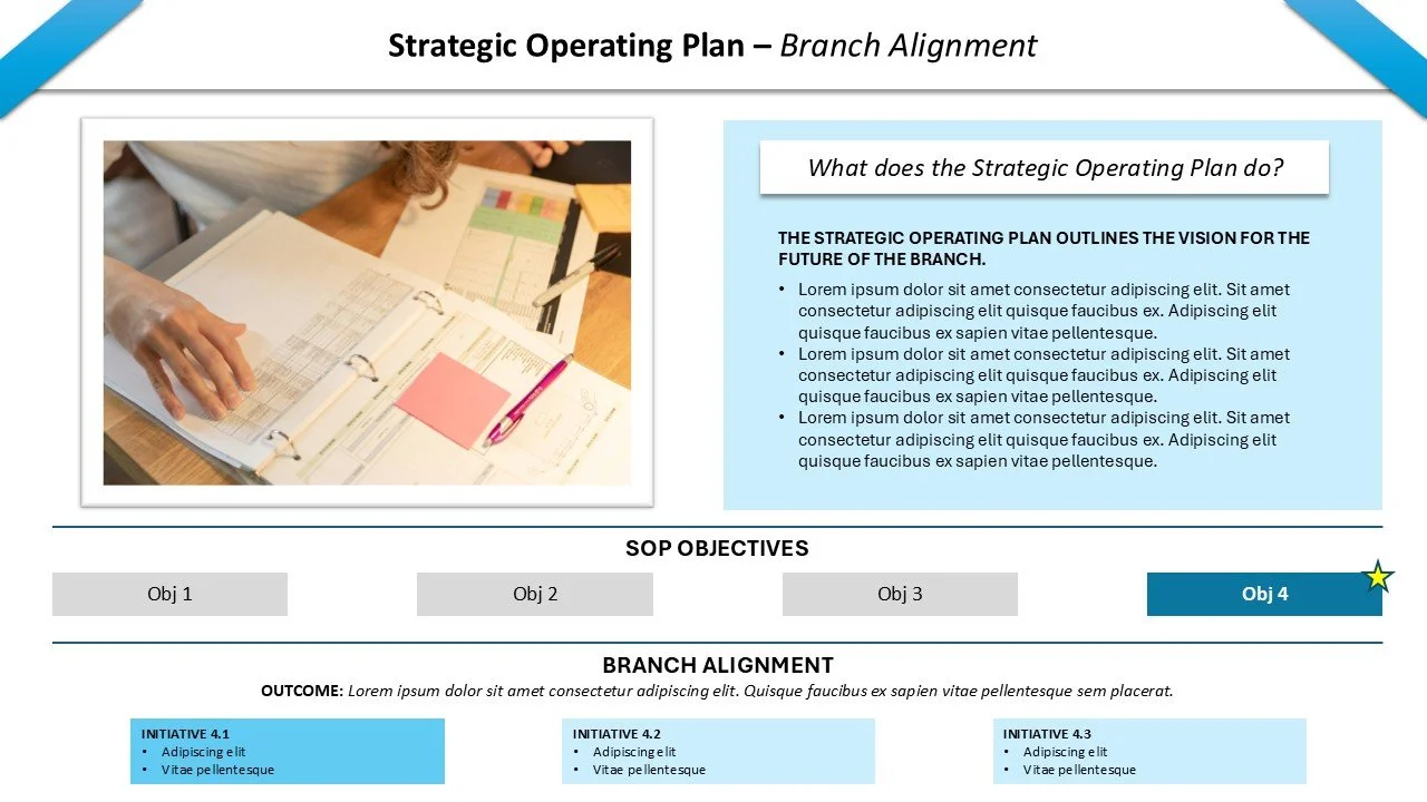
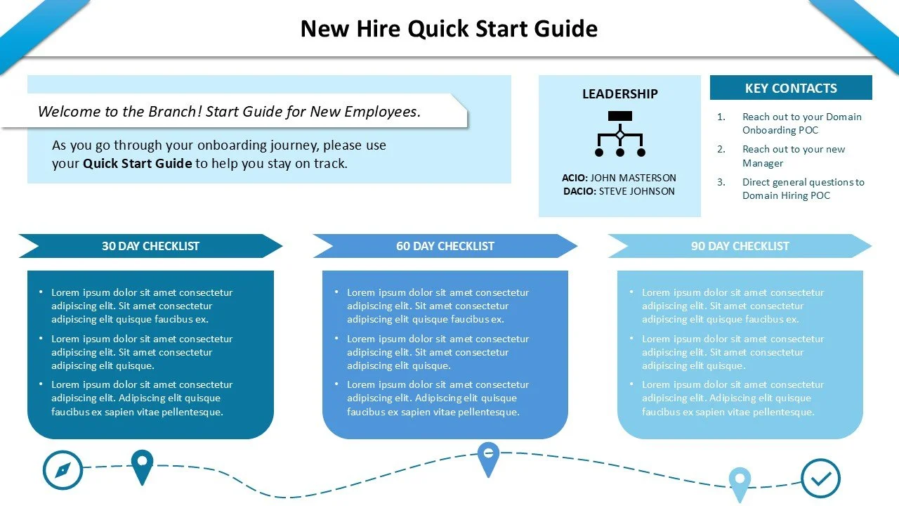
Clear hierarchy: bold section headers, consistent typography rhythm, strong spacing discipline
Component system: repeatable modules (callouts, metric blocks, dividers, label styles) for speed + consistency
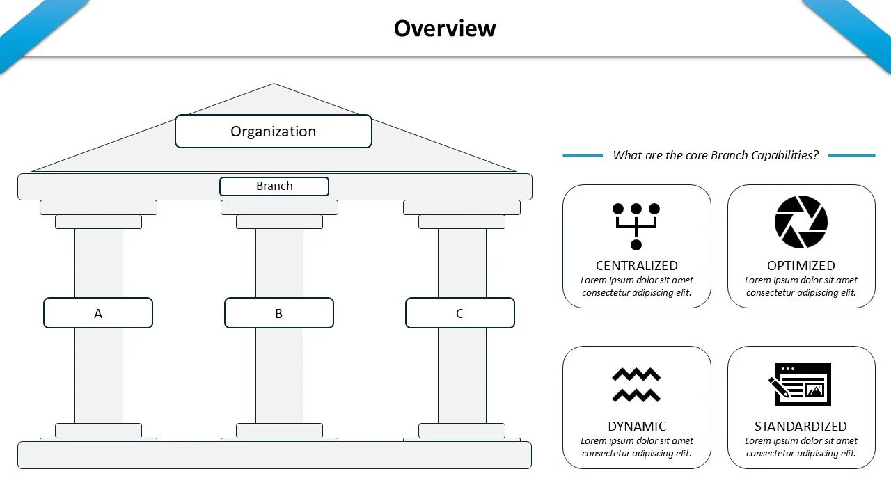
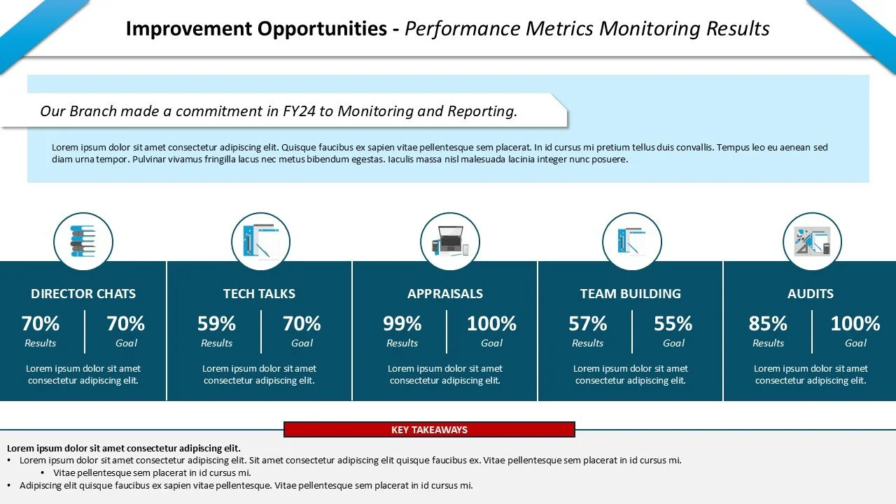
Data storytelling: metrics and outcomes presented as “at-a-glance” visuals instead of dense paragraphs
Client Satisfaction: keep text minimal, while still conveying the key points to executives that the team wants them to know and appreciate about their hard work
Take a look at the whole deck:
Title Page
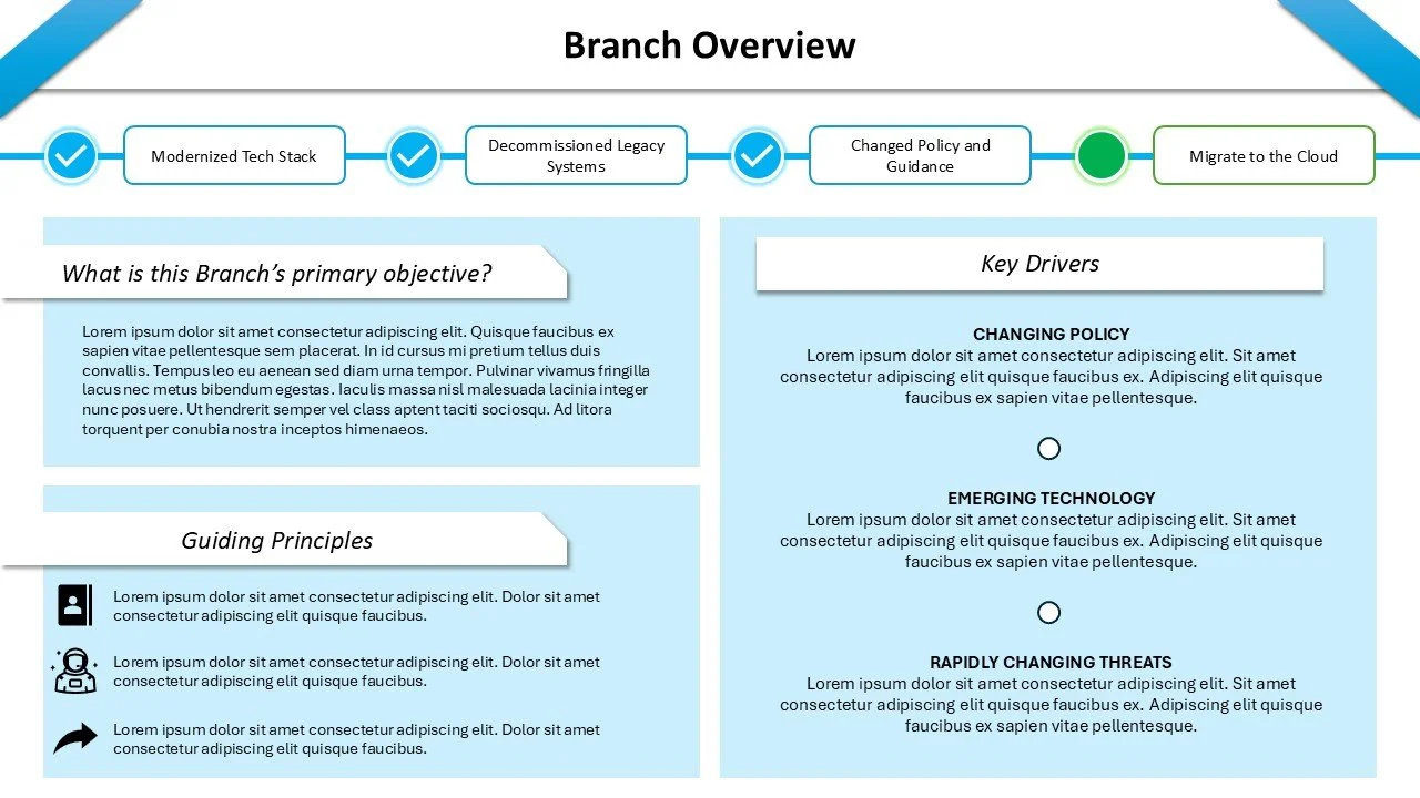
Slide 1
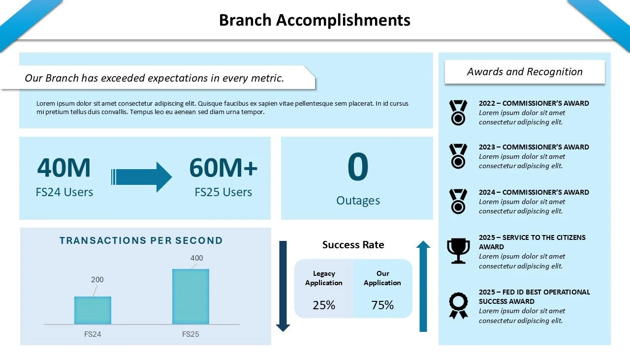
Slide 2
Slide 3
Slide 4
Slide 5
Slide 6