IRS-IAM Reporting Dashboards
Intro
As a Business Analyst supporting Identity & Access Management (IAM) within the IRS, I built and maintained reporting dashboards for two teams: Authorization Framework (AZF), which standardizes access control decisions, and Electronic Signature Storage and Retrieval (ESSAR), which tracks digital signature activity across the organization. Both teams came to me with requests that looked similar on the surface, but through ideation, research, and close collaboration with each team, it became clear their actual needs were quite different. Both dashboards rely on the same core toolset — complex Power BI data cleansing, SharePoint management, and PowerApps — but the way each one operates day to day reflects what its team actually needed: the AZF dashboard was primarily for executive level, specific presentations and therefore did not require a complex refresh schema, while the ESSAR dashboard runs on a fully automated daily pipeline. Together, they show how starting from a similar ask can still lead to two very different solutions.
AZF Dashboard
-
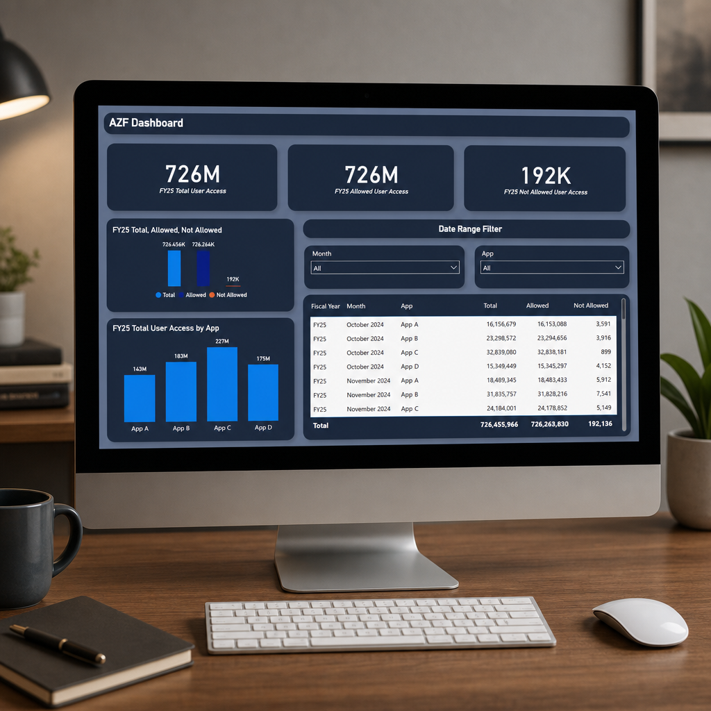
Overview
A Power BI dashboard built for the IAM AZF team — giving leadership a clear, filterable view of user access activity across protected applications for FY25. (Data shown here is anonymized to protect confidential project details.)
-
Challenge and Approach
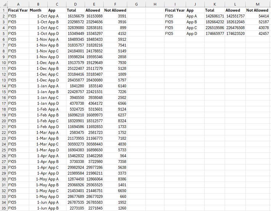
The raw data came from Splunk exports organized by calendar year, with far more fields than the team actually needed — they only wanted to see FY25, and the exports didn't support filtering by app or month at all.
To solve this, I:
Consolidated the raw Splunk exports down to only the fields relevant to FY25 reporting
Rebuilt the date structure in Excel to align records to fiscal year instead of calendar year
Reorganized the data into a clean table structured to filter by App and Month
Modeled the data in Power BI to support both summary totals and app-level drill-down
-
Outcome
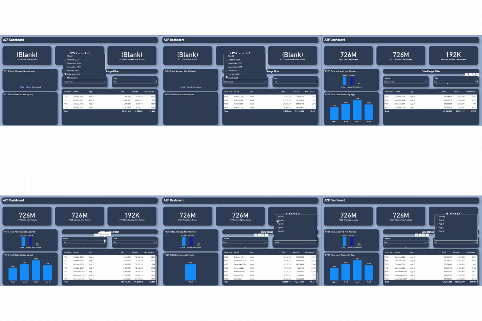
The dashboard turned sprawling, calendar-year Splunk exports into a single clean FY25 view — giving the team instant visibility into total, allowed, and not-allowed access volumes by app and month, without needing to manually reshape the data every time.
ESSAR Signature Dashboard
-
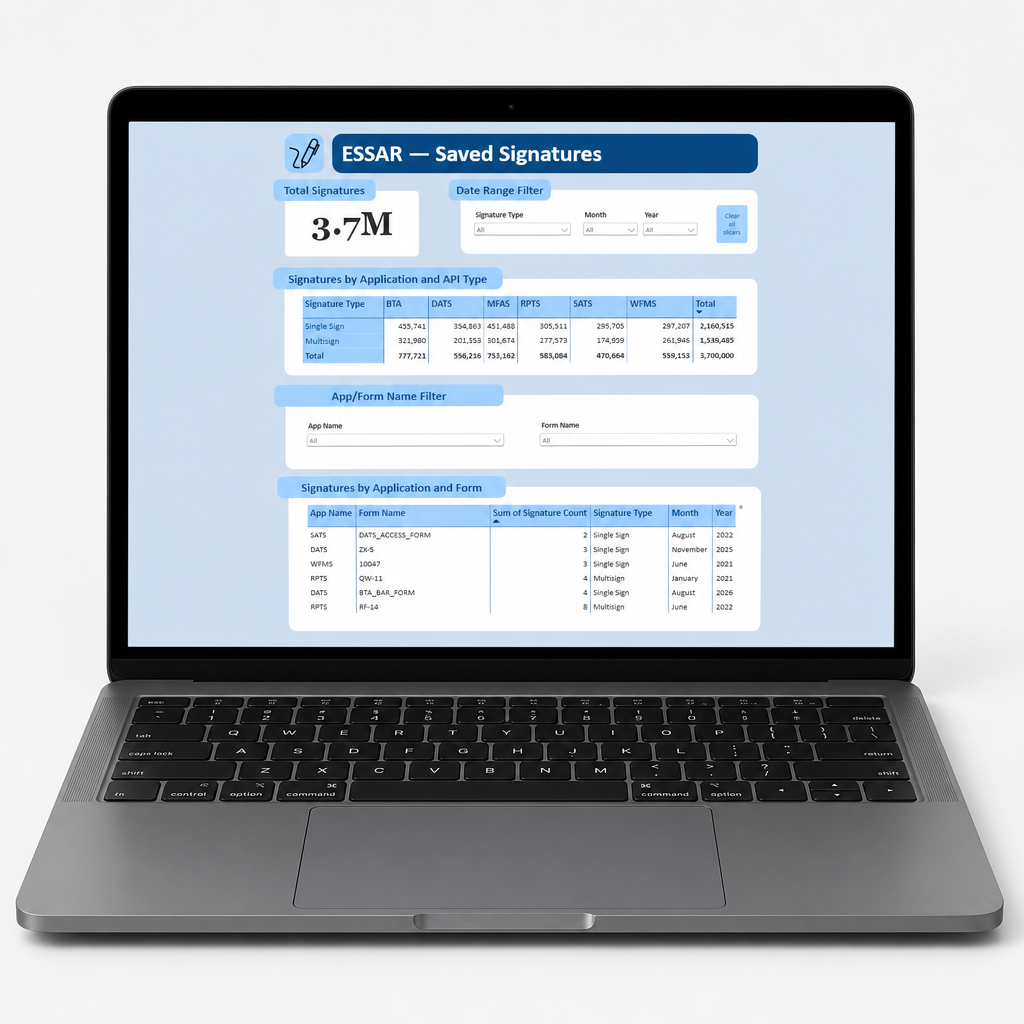
Overview
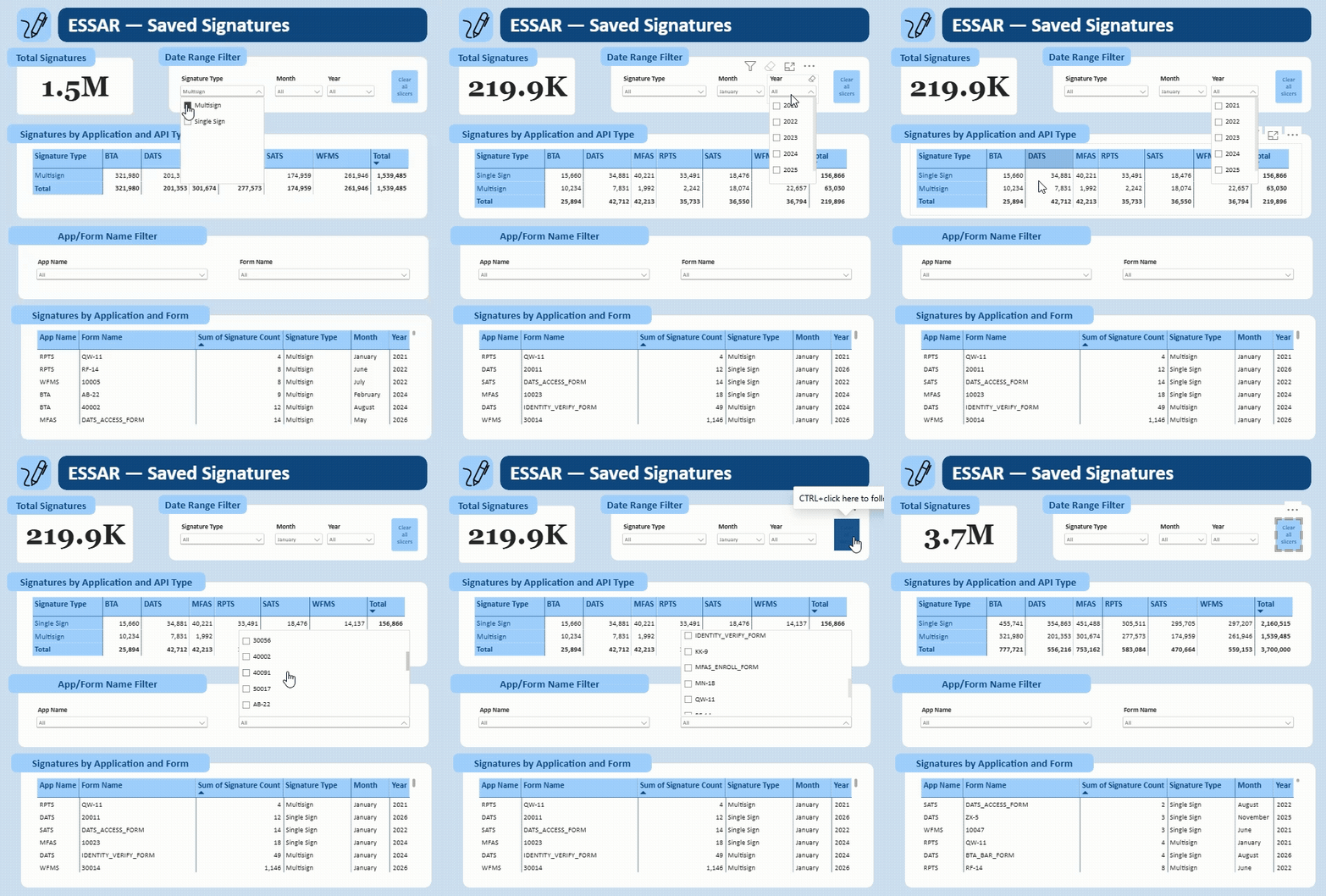
A Power BI dashboard built for the ESSAR team — Electronic Signature Storage and Retrieval — giving leadership daily visibility into digital signature activity across the organization. Unlike a static report, it updates itself every day with no manual intervention required. (Data shown here is anonymized to protect confidential project details.)
-
Challenge and Approach
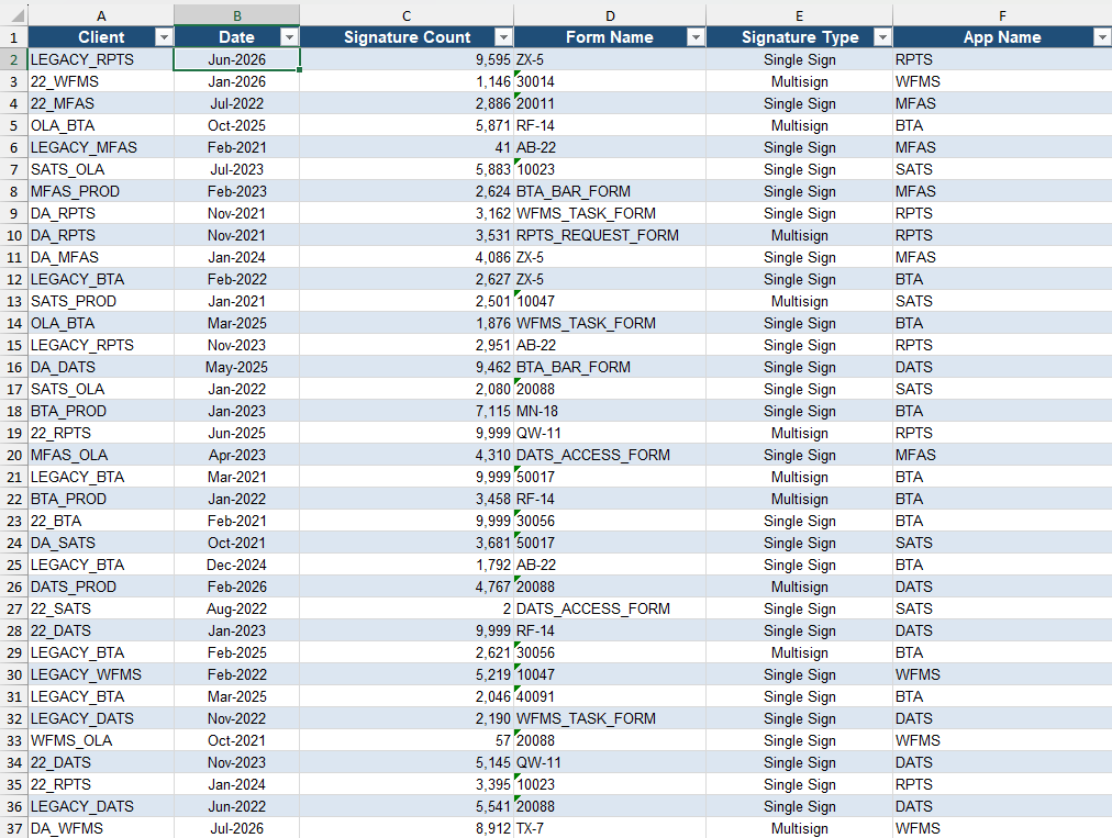
ESSAR's data lived in a shared mailbox as a daily email, with app names and formatting that didn't match what the team needed to see, and no existing pipeline to get it into a reportable state automatically.
To solve this, I:
Built a Power Automate flow to move the daily email from the shared mailbox into a SharePoint folder automatically
Connected Power BI directly to that SharePoint folder as a live data source
Wrote custom Power Query logic to create a calculated column aligning app names to the team's viewer-facing nomenclature
Corrected data types and standardized date formatting so the model would refresh cleanly every day
Designed the report to reflect the day's signature activity without any manual touch-up
-
Outcome
The result is a dashboard that refreshes itself daily — no manual exports, no reformatting, no waiting on someone to update a file. It's become a daily habit for the team, with 24 members checking it regularly to stay on top of signature status.